If you don’t know Michael Dearing, you should. In a fantastic story by Leigh Buchanan in Inc’s March issue, Dearing, who’s on the faculty of Stanford’s design school, riffed on the eternal entrepreneurial topic of how to scale your company without losing the cultural idiosyncrasies that make you a special startup.
Design is not Dearing’s only specialty. He’s an MBA with an economics background and a former executive at eBay, Bain, Filene’s Basement, Disney, and Industrial Shoe Warehouse. On top of all this, he’s the founder of Harrison Metal, an early-stage investment firm. Recently, on the Harrison Metal site, he posted a two-minute video on how to design better meetings.
His big takeaway: If you make your meetings more like a science fair, participants will be much more engaged and attentive.
At old-school science fairs, there are no PowerPoint presentations. Sitting at a table while someone else narrates a sequence of pre-scripted visuals is not the norm.
Instead, participants are active. They walk around a room, or several rooms. They stop at each presentation to look, study, and comment. And then they move on.
Dearing suggests modifying your meetings to be less like sedentary slideshows—and more like attention-grabbing science fairs. Specifically, he proposes hanging any materials you want to review on a wall. “Lead everyone item-to-item, science-fair style,” says the video. “Get information and opinions as you go. The group stays engaged and moves quickly among items. They can also remove, combine, or modify items more easily.”
Another key to this approach is democratizing the note-taking. There are two techniques you can use, separately or together:
-
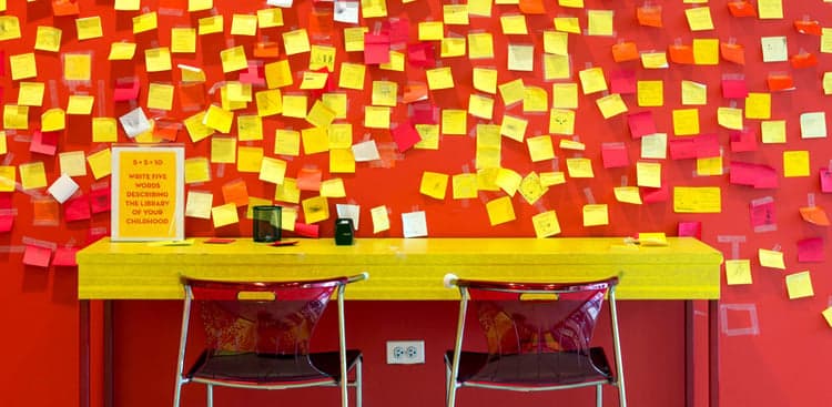
Collect Input on Post-it Notes: Then read the notes aloud to the group. The idea is to “equalize airtime.” If participants have to limit their comments to one Post-it note, you can come closer to evaluating their input by its on-paper merit, as opposed to the volume or vehemence at which participants voice their opinions. Better still, if you anonymize the Post-it notes, you’ll get even closer to evaluating the pure merit of the input and avoid the quid pro quo politics that can compromise the spirit of collective improvement.
-
Take Notes On Whiteboards: This can help if, as the leader of the meeting, you’re trying to evaluate whether the group has properly digested the information. Ask one participant to diagram the meeting by taking notes (or sketching) on the whiteboard. Then invite other participants to amend or modify what’s on the whiteboard. It’s a fast, transparent way to see if all participants are hearing and processing the same thing.
These techniques, notes the video, are ways of “adjusting behavior dials to design a better meeting.”
They are from the same school of thought that advocates for stand-up meetings or huddles, like the ones used at Method in San Francisco. The idea is to broadcast a simple message, before the meeting even begins: We are not going to stand here long. This meeting is going to be so fast that we’re not even going to sit.
As for the Post-it notes and whiteboards, one company that’s used them successfully is HubSpot in Cambridge, MA. Specifically, the company’s UX group follows an “always be capturing” mantra at meetings, where it aims to record a visual representation of every key idea.
Two lessons that this team has learned:
-
Write Down or Sketch Everything Important: “For example: If you’re comparing two things, just make a two-column table and write out the differences. If you’re talking about a bunch of features, write them down on Post-its and sort them on the wall,” is what Joshua Porter, HubSpot’s director of UX, once told me.
-
Appoint a Facilitator: The facilitator can serve as an objective manager of the discussion. She can simultaneously make sure that everything gets illustrated or captured, and she can also keep the meeting on-point, so it doesn’t last too long.
Since implementing these techniques, HubSpot’s design sessions have become twice as efficient. “We quickly move from project to project, secure with the knowledge that everything we’ve discussed has been captured somewhere,” says Porter. “Just knowing that we have a record of all the design work we’ve done makes us more confident, effective designers.”

