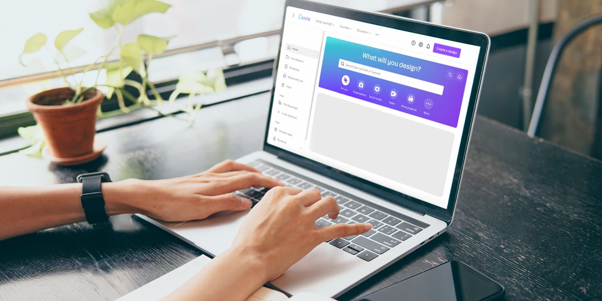
Creating your resume in Canva can feel like manifesting a makeover. What can seem like a plain and boring document suddenly looks colorful and eye-catching.
So as a career coach, when I meet with clients who’ve spiced things up by making a Canva resume, I hate breaking the news that their fancy new document probably won’t make it through an applicant tracking system (ATS), the software recruiters and hiring managers use to organize and sort through online applications. I steer them back toward a Word or Google doc, and show them how you can still feel dressed up but actually get noticed.
Here’s why I regularly give this advice—and when you can make an exception.
Wait, what’s the issue with using Canva to build a resume?
Every bit of text on a Canva resume template is placed using text boxes, no matter which template you select and even when you create your own design from scratch. This makes for nicely spaced resumes, but it won’t help in getting your content read properly by an ATS.
Elements including text boxes, tables, headers and footers, images, and columns can trip up an ATS scanning your resume and turn your carefully crafted document into a jumbled, nonsensical mess. Even if you make your resume in a Word doc, you should still avoid using all of these to ensure your content is readable. And though some Canva templates are simpler and cleaner than others, they’re all built on text boxes and other elements an ATS might not be able to decipher properly. Plus, you can download your Canva resume as .pdf, .jpg, or .png files, but not as .doc or .docx files, which are most easily parsed by an ATS. Finally, the most popular applicant tracking systems all search for information differently, making it even more important that you create your resume with straightforward formatting and content.
All of these factors make it hard to recommend selecting any of Canva’s templates or even creating your own when you’re applying for a job online.
And while the ATS is the most immediate hurdle, a review of some of the available templates tells me they might lead you astray in other ways. For example, some guide you to include resume objectives, which are outdated and unhelpful; photos of yourself, which don’t belong on your resume (not in the U.S., at least); or sections that list references or state, “References available upon request,” which you just don’t need. Some reserve disproportionate space for your contact information, which belongs on your resume but doesn’t warrant a quarter of the page, or leave very little room for you to list your work experience with meaty bullets describing your impact and accomplishments.
When *is* a good time to use a Canva template?
When you’re bypassing the online application system entirely and emailing your resume directly to a contact—maybe someone you know or have been referred to—you might consider impressing them with a nicely designed Canva resume. Or once you’ve gotten through the ATS and made contact with a person, you can send a fancier resume to share with the people you’ll be interviewing with. Just be sure you’re including the right sections and information and keeping in mind that humans looking at your resume also don’t want to be overwhelmed by a super busy or indecipherable document.
As applicant tracking systems improve, my hope is that job seekers won’t have to worry about how a resume is built and will be able to have fun with the design. But for now, hold off on using your Canva resume until after you’ve made it through the online system.
OK, cool. So how should I make my resume?
If you’ve been using this type of resume to apply and aren’t having much luck with positive responses, this is a great time to see if things improve with a simpler resume created in Word or Google Docs.
Here’s some more advice on putting together a resume that will help you land interviews and jobs:
Check out even more resume advice and, if you need some extra or more personalized help, you can book a resume review with me or another Muse career coach.

