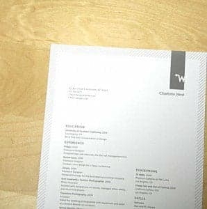
What’s the difference between a decent resume and truly stellar one?
A killer resume is more than a list of your experiences—it’s a package that shows off who you are and why you’re a qualified candidate for the job. So read on for tips on creating a resume that gets noticed, not tossed in the trash.
1. Find a Professional Font
As fun as it might look on the page, now is not the time to use weird fonts. Unless you are working in a creative field where you should be showing off your style, stick to something classic. Times New Roman is great go-to, or try a serif font with a little more individuality, like Book Antiqua or Lucida Bright.
2. Put the Good Stuff First
The real secret to a good resume is focusing your reader’s attention. In an ideal world, recruiters would read every word on your resume. In reality, that rarely happens. I’ve screened hundreds of resumes, and though I’m more meticulous than most, I’ve been surprised by how many I nearly tossed, only to find something truly interesting buried at the bottom of the page.
Also, the biggest mistake is to use chronological order. Why lead with “Babysitter in High School” when you could lead with “Strategic Planning Analyst?” Even reverse chronological order (which is more common) may not give you the flexibility you want to highlight your best and most relevant accomplishments.
3. Be Specific
You increased recruiting? Give us the percent increase. You raised money for charity? Tell us how much you raised! This can turn average-looking experiences into impressive head-turners and help distinguish you from other candidates. The flip-side of that is that specifics can also make some accomplishments look worse. If you only raised $150, you might want to think twice before including that—it’s unlikely to impress a billion dollar company.
Hint: This is true of your classes as well. Mentioning relevant coursework can help catch a recruiter’s eye.
4. Vary Your Verbs
If every bullet in your resume starts with “Responsible for,” readers will get bored very quickly. Use this handy list of action verbs to mix it up!
5. Make Every Word Count
Unless you’re a tenured professor who needs to list every book and article you’ve ever published, your resume should be one page. While this limits the space you have to share your experience, think of it as a blessing in disguise: It forces you to focus.
You don’t need an equal number of bullets under each experience. You should be spending more words on your most impressive set of experiences. Moreover, if a job isn’t relevant anymore, take it out! You don’t need to prove that you’ve been employed since 1997.
Can’t make things fit on one page? Keep cutting it down. You can play with margins and font sizes a bit if necessary—but don’t overdo it. The point is to choose the right experiences, not squish them in. Plus, a dense resume is harder to read. And the harder your resume is to read, the more likely people will just skim it.
Hint: You can make the font size of the spacing between text smaller without losing legibility
6. Proofread
Grammar or spelling errors in a resume can be the difference between the “keep” pile and the “trash” pile. At best, you look sloppy. Enough said.
7. PDF, PDF, PDF
This one is simple: PDFs look the same on any computer. Word documents, on the other hand, can show up with wacky formatting or spill onto a second page if opened with a different version of Word or on a PC vs. a Mac. Make sure companies see what you wanted them to see.

