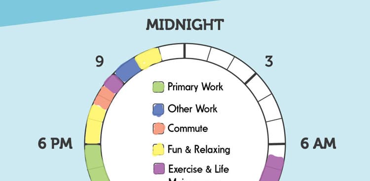
When Info We Trust's graphics depicting the average days of creative geniuses of yore went viral earlier this week, we were impressed like so many others—after all, it's pretty cool to see how the masters made it work!
But more importantly, we thought this method of visualizing time was an awesome way to quickly understand what each of these masters spend their time doing—and would be something that all of us could use to get a better handle on our own time. After all, the first step in becoming more productive is understanding where your time is going now!
It's simple—grab the visual below (click for the full-size image) and then either print it out or open it up in MS Paint or Photoshop. Using the paint tool (or your colored pencils), give each activity a unique color, and then color in each hour of the circle based on the activity you usually fill that time with.
You'll quickly be able to see how you organize your day, the things you're doing well, and the things you could probably improve upon. For example, I filled out a Wheel of Producvitiy for my own days below, and can easily see that I do well on the sleep front, but could probably try and break up my big block of green work time (by taking an actual lunch break, perhaps, or going to the gym midday instead of in the morning).
Fill out your own Wheel of Productivity, and then give it a hard look: Are you devoting enough time to the colors that matter most to you?

